Breadcrumbs- UI Design Guide

Why Breadcrumb are Important?
- Navigation Aid: Breadcrumbs provide users with a trail of links that show their path from the homepage to their current location within the website.
2. Hierarchy Display: They typically display the hierarchy of the website’s structure, making it easier for users to understand their current location within the site’s architecture.
3. Easy Backtracking: Users can easily backtrack to higher-level pages by clicking on the breadcrumbs, without having to rely solely on the browser’s back button.
4. Enhanced User Experience: Breadcrumbs enhance user experience by providing clear navigation cues, reducing confusion, and improving overall usability.
5. SEO Benefits: Breadcrumbs can also have SEO benefits by providing search engines with additional information about the website’s structure and content hierarchy.
Overall, breadcrumbs serve as a helpful navigational aid, improving user experience and site usability.
Anatomy of Breadcrumbs:
1. Home Icon or Screen: Usually placed at the beginning of the breadcrumb trail, this icon or link represents the homepage of the website.
2. Separator: A visual indicator, such as a “>” or “/”, that separates each breadcrumb item to denote the hierarchical structure.
3. Breadcrumb Items: Each clickable item in the trail represents a specific level within the website’s hierarchy, leading from the homepage to the current page.
4. Clickable Links: Breadcrumb items are usually clickable, allowing users to navigate back to previous levels of the site’s hierarchy.
5. Current Page: The last item in the breadcrumb trail typically represents the current page or location within the website.
6. Hierarchy Representation: Breadcrumbs visually represent the hierarchical structure of the website, making it easier for users to understand their location and navigate back to higher-level pages if needed.
The anatomy of breadcrumbs helps users understand their location within the website’s hierarchy.

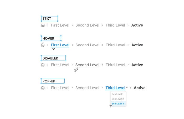
States of Breadcrumbs:
1. Text State: This is the default state of breadcrumb items, where they display the text representing each level of the hierarchy in the navigation path.
2. Hover State: When a user hovers their cursor over a breadcrumb item, it may change in appearance to provide visual feedback, such as a color change or underline, indicating that it is clickable.
3. Disabled State: Breadcrumb items may become disabled in certain situations, such as when the user is already on the corresponding page represented by that breadcrumb item. In this state, the item appears faded or grayed out to indicate that it cannot be clicked.
4. Pop-up State: Some websites use a popup menu or dropdown menu to display additional options or related pages when a user interacts with a breadcrumb item. This state allows users to access a menu of related content without leaving the current page.
Each of these states serves to enhance the usability and functionality of breadcrumbs, providing users with clear navigation cues and options for exploring the website’s hierarchy.
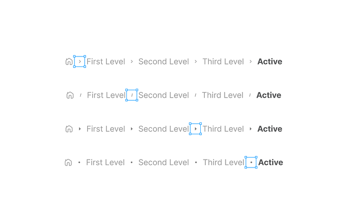
Breadcrumb Separators:
Visual elements used to visually separate individual breadcrumb items within the breadcrumb trail. Here are some common types of breadcrumb separators:
- Angle Bracket (>): This is one of the most common separators used in breadcrumbs. It resembles a greater-than sign and is placed between each breadcrumb item to indicate the hierarchical structure.
- Slash (/): Another widely used separator is the slash, which resembles a forward slash (/). It is often used to visually separate breadcrumb items and denote the hierarchy of the website’s structure.
- Pipe (|): The pipe character is also commonly used as a breadcrumb separator. It is a vertical line (|) and is placed between each breadcrumb item to indicate the navigation path.
- Arrow (→) or Triangle (▹): Some websites use arrows as breadcrumb separators. These arrows can be simple or stylized, pointing from left to right to indicate the progression through the breadcrumb trail.
- Bullet (•): Breadcrumbs may also use bullets as separators. These can be simple round dots (•) or stylized bullets to visually separate each breadcrumb item.
Separators serve to visually delineate each breadcrumb item and provide users with a clear indication of the hierarchical structure of the website’s navigation path.
Collapsed Breadcrumbs:
A collapsed breadcrumb is a user interface design pattern where the breadcrumb trail is condensed or simplified to take up less space, typically due to limited screen real estate.
In a collapsed breadcrumb, only the current page or the last few levels of the navigation path are displayed, while the rest are hidden or represented by a single clickable element.
When a user interacts with the collapsed breadcrumb, such as clicking on the single clickable element, a dropdown menu or popup may appear, revealing the full breadcrumb trail or additional navigation options.
This allows users to access deeper levels of the website’s hierarchy without cluttering the interface with a lengthy breadcrumb trail.
Collapsed breadcrumbs are useful for mobile devices or websites with limited horizontal space, where displaying the full breadcrumb trail may not be feasible.
They help maintain a clean and uncluttered interface while still providing users with access to hierarchical navigation options.

Truncate Breadcrumbs:
Truncated breadcrumbs are a design pattern used to shorten or abbreviate the display of breadcrumb trails, typically to fit within limited space constraints or to prevent visual clutter.
In truncated breadcrumbs, only a portion of the breadcrumb trail is displayed, with the beginning and end of the trail omitted or replaced with ellipses (…) to indicate that there are additional levels in the hierarchy.
When a user interacts with the truncated breadcrumbs, such as hovering over or clicking on them, a popup or tooltip may appear, displaying the full breadcrumb trail or additional navigation options.
Truncated breadcrumbs are useful in situations where horizontal space is limited, such as on mobile devices or in narrow website layouts.

